The managed learning environment is a collection of resources, in our instance related to Art & Design teaching and learning — this is our data.
The way this data is stored specifically digital data in the current systems be that our personal computer or our online environment tend to mirror the office of the 1960’s.
Conventional electronic documents were designed in the 1970s by well-funded conventional thinkers at Xerox PARC, who asked, “How can we imitate paper?” (Nelson,2016)
Teaching and learning resources are uploaded to blackboard for ease of access and to save paper. The only difference in regards to distribution is bits rather than atoms, the principles are fundamentally the same. The interfaces we use to navigate teaching and learning resources are based on the principles of paper.
Research into interface design and potential speculative futures based on a longer look at design history and future thinking interfaces that apply human centre design
Industrial design
By unlocking learning data via the guiding principles of information design, there is the potential to realise and discover new avenues of making and thinking. The application of this principle within an networked environment that caters for and nurtures a learning network (Watters, 2015) via a set of ‘starter’ materials has the opportunity to unlock ideas that we have yet to realise.
- Timetable
- Scheme of Work
- Detailed Session Plan
- Slides (launches / information)
- Project Brief
- Reading list
- Workshop Materials Outline
- Videos / Training Videos
- Links (URL’s)
Keep it Simple Stupid (KISS)
- Slide deck
- Text Document
- LINKs
Of, or relating to space and the relationship of objects within it
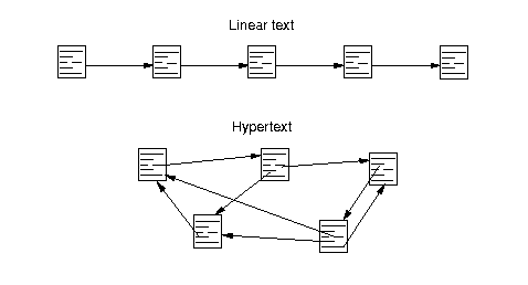
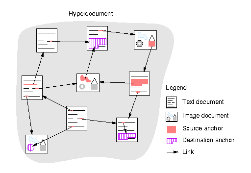
The world wide web (www) imitates this paradigm of documents, all be it connected but still the connections are unclear and unseen. Ted Nelson refers to them as ‘Jump-links’ as you don’t know where you will land.
Blackboard, Moodle et all. continue to emulate this process, again connected to the administration of the learning and not to the develop or consideration of the learning so most interfaces we engageswith now are either based on navigating documents and folders or more recently in timelines. To get around the disconnect of the connections, search has led the way to help us understand these pieces but still does not provide context and connections in a visual way.
Looking at the work of Ted Nelson and others and connected this thinking to studio based networked learning, The PhD will present new ways to visualise and represent the learning materials.

Discovr
Graph Commons

http://www.iicm.edu:8000/hwbook/3/node26.html
Ted Nelson Xanadu
https://www.youtube.com/watch?v=gl0Wfs70rV4
A spatial interface allows users to take advantage of their visual memory and pattern recognition. (Shippman F M, Marshall C, 1999) http://cs.brown.edu/memex/ACM_HypertextTestbed/papers/37.html
Shippman F M, Marshall C, 1999. Spatial hypertext: An alternative to navigational and semantic links. 31, pp.U69–U73.
http://www.eastgate.com/download/SpatialHypertext.pdf
Spatial Interfaces by Pasquale dSilva
https://medium.com/elepath-exports/spatial-interfaces-886bccc5d1e9
Nuclino app
Spacial UI for firefox
https://en.wikipedia.org/wiki/Doug_Turner_(Mozilla)
Twenty-five years from now, no one will be clicking on drop-down menus, but everyone will still be pointing at maps and correcting each others’ sentences. It’s fundamental. Good information software reflects how humans, not computers, deal with information.
http://worrydream.com/MagicInk/#case_study_train_schedules
Visualisation
Ideally, simplification means making the content (the product, the system or the rules) simpler but often all we want to do is present it in a way that is easier to use and understand. (Simplification Centre, 2010) Centre for Information Design Research
The terms data and information are often used synonymously, but it’s important to differentiate between the two. Data holds no meaning on its own, it’s through the process of interpretation and the assignment of meaning that data becomes information. (InformForm, 2012)
Instead of data visualisation, Felton imagines a future built upon pure insight. No one needs to see a weather radar, he contends, when all you really want to know is whether or not you need an umbrella. (Fast Co Design, 2015)
Context driven design is seamless and almost transparent, a recent update to the app Dark Sky enables custom notifications on the weather conditions to prompt the user to take action without the need to ever view the user interface (UI); the Apple WATCH Glances offer a similar option.
We are not concerned with is “data decoration” (Mollerup, 2014) and so it is clear to lay down issues within this field and pin point the principles of information design.
Joseph D. Novak took Piaget’s work into the visual realm and invented Concept Mapping in 1972 as a result. The idea is very simple though there are conventions which add to the power of the system and which constrains it, such as adding labels and arrows to the connecting lines. The basic idea is to let the user put whatever knowledge they have on an issue onto cards (physical or virtual) which can then be laid out in patterns and lines can be drawn between them.This then allows the user to organise their information visually and to see where there might be gaps and contradictions – using the powerful human visual processing system to augment their (relatively) tiny working memory.This allows us to ‘see’ our own thoughts, which is a powerful tool to help us understand our own thoughts and how they relate to the available information about the world.The result of this process is revelatory and useful, but it has a few downsides which need to be addressed: This view does not easily convey a narrative to guide a secondary reader, it does not support long-form writing and there are no common document formats to interchange the layout.
http://wordpress.liquid.info/liquid-view-pitch-5/
http://wordpress.liquid.info/joseph-d-novak-concept-mapping-pioneer/
Keywords
Bret Victor / IBM / Parc Xerox / Ted Nelson / Alan Kay /
Ivan Sutherland, Marvin Minsky, Seymour Papert, Gordon Moore, Bob Barton, Dave Evans, Butler Lampson, Jerome Bruner,
References
Tuft, E., 2001. The Visual Display of Quantatife information
Mollerup, P., 2015. Data Design, Bloomsbury Publishing.
Nelson, 2016, xUniverse-D6. xanadu.com. Available at: http://xanadu.com/xUniverse-D6 Accessed March 29, 2017.
Paraizo, R.C. & Kós, J.R., 2010. Heritage, Place and Interactivity: Rethinking Space Representation. … of Research on Technologies and Cultural
Styliaras, G., 2010. Handbook of Research on Technologies and Cultural Heritage: Applications and Environments, IGI Global.
CONCEPT MAPPING literature review ??
Can We Talk about Spatial Hypertext? Mark Bernstein
