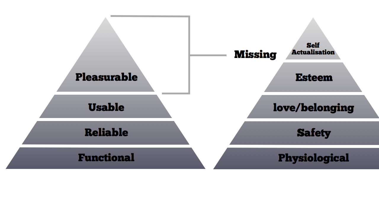
Emotional design for user interfaces has more recently been directly connected to Maslow’s Hierarchy of Needs (Maslow, 1943). In Designing for Emotion (Walter, 2011) Walter starts the book off with the conclusion that for a truly great user interface you need to provide what he translates from Maslow’s theory to a moment or moments of pleasure. This is of course an over simplification of Maslow’s theory. Although not inaccurate this specific approach is then connected to anthropomorphic design and personality design choices that aim to please the user through the abstraction of the digital binary into human interactions.

This approach has thus been connected from pleasure to delight.
delight |dɪˈlʌɪt| verb with object please (someone) greatly: an experience guaranteed to delight both young and old.
Within design the term delightful is often being considered in terms of adding a character or a personality into an application to make it more human. This has seen the rise of services utilising an object or animal with human characteristics (Tuah, 2016. Catrambone, 2002). Such recent commercial examples include Twitter, Duolingo, Waze, Headspace, Tapsbots apps Tweetbot, Pastebot, Weightbot and CalcBot, alongside Internet connected products such Bergs little Printer and Schooloscope, which took complex data about school performance and visualised this as anthropomorphised school houses.


Of course one of the early examples in Human Computer Interaction (HCI) often cited in an attempt to humanise the interface is the often derided Clipit or Clippy one of the assistants within Microsoft Office.

Clippy was part of Office Assistant. Clippy however was not well received in user testing (Meyer, 2015) prior to inclusion in the release of Office 97 and subsequently didn’t fair any better with users after release. Yet Clippy was part of a series of work where Microsoft looked at using animated characters (McKraken, 2009) within there interfaces and according to Alan Cooper (Cooper, Unknown) Clippy this was due to a “tragic misunderstanding” of research conducted at Stanford University by Nass and Reeves (Nass et al., 1995) that showed that when people use computers parts of the brain react in the same was as people to people interaction and as such it could be beneficial to include a human-like side within their software.
Clippy’s aim as part of a suite of intelligent software was to identify a task you where undertaking and provide assistance. Rather than using a standard dialog based wizard1 Clippy’s human characteristics would reduce your frustration and enable you to complete the task in a positive and delightful manner. Unfortunately Clippy’s reliance on this intelligent was probably a little too early in the history of artificial intelligence within consumer devices and Clippy would often be asking users if they wished to “Format a Letter” again and again.
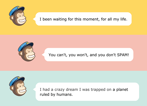
A more recent example of this type of Human Computer Interaction is Freddie the Mailchimp Monkey, a very successful implementation of humanisation to support user actions. Freddie has much more intelligence to support his own interactions and he is held within a much more focussed environment, that of sending bulk email. Freddie works well for a number of reasons but at the core of his design is the fact he is a direct extension of the MailChimp brand, without Freddie, MailChimp wouldn’t be MailChimp.


Freddie makes quips and jokes as you navigate the interface. He is very context aware and knows what you have done before and has access to information about you which allows his interactions to have a deeper level of personalisation. However his main aim is to enhance the MailChimp brand. Freddie is clearly a cheeky monkey dressed to look like a postman. He is always ready to help you deliver your electronic mail. His interactions and interventions are designed to make a tedious, repeatable task more enjoyable. Clippy was context aware however Freddie is much more sophisticated and doesn’t make the mistake of forgetting previous interactions. His context awareness and its implementation are an important part of the process of humanising a purely electronic transaction, it makes Freddie appear to be alive.
Referring to the similar examples and more Jerry Cao, Kamil Zieba and Matt Ellis attempt to Deconstruct Delightful Design in a Fastco Blog post(Cao et all, 2016) suggesting;
Delightful design is the icing on the cake, but only the very best icing … And that by weaving in elements of delight that do not distract from usability … you’ll create a state of pleasurable functionality.
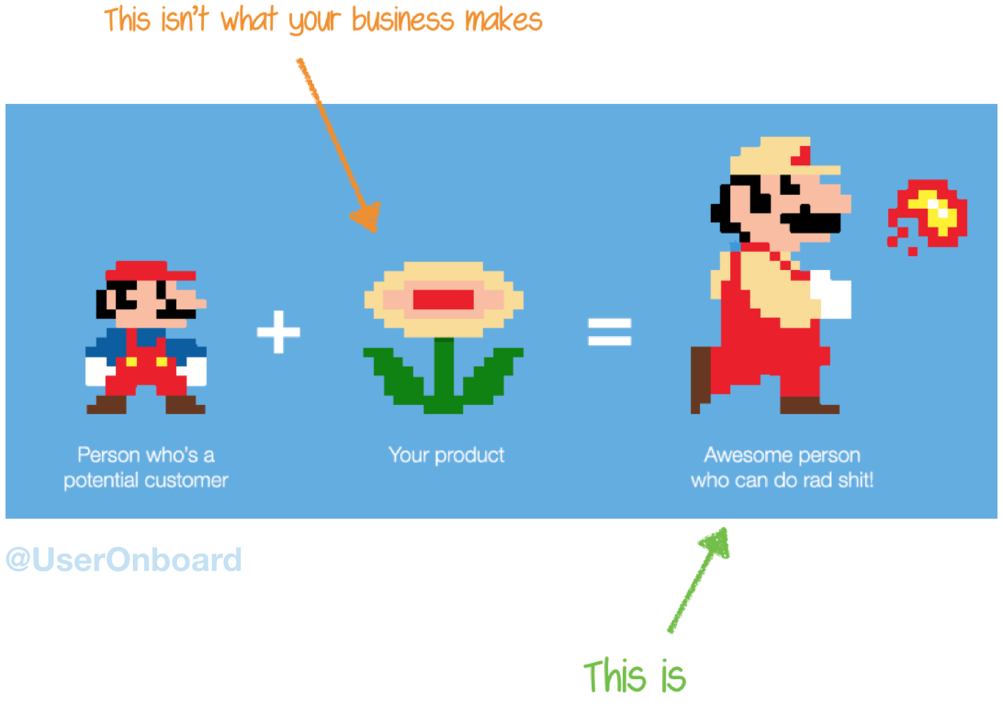
I disagree and feel this is a fundamental misunderstanding of the role of Delightful Design within Human Computer Interaction. I will argue that this process must not sit on top of functional or usable interfaces but should be an integral part of the design process. A functional and usable system is not adequate. Their article concludes with a quote from a User on Board blog post (Anon, 2013) that states:
people don’t buy better products, they buy better versions of themselves.

Feel good, Buy stuff
Another example of this context aware design and pleasurable approach to user interfaces has been growing over the last decade and has been used with great effect within social media platforms and tech start ups. To understand a user and provide moments of pleasure and greater context awareness you need to know much more about that user. So data collection has become the objective and business model of the most prominent technology we engage with on a daily basis.
Advertising revenue is the business model for Facebook, Google and the vast majority of technology companies. This revenue is driven by data gathered about users interactions across multiple touch points that allow advertising to be directed but also allow the technology company to manipulate the persons view of the data they provide or show, so as to retain user attention and thus serve up more adverts and subsequently gather more data. These services often hand data over to each other to track users across platforms. Facebook and others ensure users stay on a site for as long as possible by providing dopamine hits.
Facebook’s founders knew they were creating something addictive that exploited “a vulnerability in human psychology” from the outset. (Parker, 2017)
This type of behavioural change is discussed in detail within Thinking Fast and Slow (Kahneman, 2012), Nudge (Thaler, 2012) and Hooked (Eyal, 2014). It is however not delightful to manipulate people and is purely motivated for profit and not empowering. Clippy was annoying, but with this next level of data and context driven purely out of business and algorithmic needs new concerns arise that provide cruel repercussions. Eric Meyer tragically lost his daughter to Cancer in 2014 and Facebook’s year in review greeted him with the message “Eric, here’s what your year looked like!” followed by an image of his deceased daughter. Facebook in this instance didn’t have all the data and made a very poor choice (Meyer, 2014).
Our lives are a string of experiences. Experiences with people and experiences with things. And we, as designers — as the people who craft experiences — we have a profound responsibility to make every experience as beautiful, as comfortable, as painless, as empowering, and as delightful as possible (Balkan, 2013)
CP Snow (1959) lamented the fact that the intellectual life of the whole of western society was scarred by the gap between the opposing cultures of science and engineering on the one hand, and the humanities on the other.
The increasing use of chatbots within our connected services will also likely see a rise of humanisation through playful interactions however the need to understand context is highly important, when portraying algorithmic interactions as real interactions.
Within the design of our connected society we appear to have lost our way. Delightful Design in the broadest sense should be embedded in the design process and is fundamental when our live are mediated through a constant connected society.
The aspiration to empower Humans through the interactions they have to undertake is what is Delightful Design. It is not injecting personality that might win over your target audience, or nudging them to purchase more items.
I thus want to reclaim the term Delightful Design and insist that it is fundamental when designing interfaces and interactions for Humans, not for pleasure but for empowerment. It is not the icing on the cake, amusing wit, whimsy or a paperclip brought to life, although your product may require those things, Delightful Design is the most effective way to design Human Computer Interaction.

Why Delightful Digital Design Educational Tools?
(STILL IN DRAFT this section)
Section Bibliography
- Anon, Never Mix Up Features with Benefits Ever Again | User Onboarding. Available at: https://www.useronboard.com/features-vs-benefits/ Accessed December 19, 2017.
- Cao, J. Zieba, K. Ellis, M. Delightful Design, Deconstructed. fastcodesign.com. Available at: https://www.fastcodesign.com/3055221/delightful-design-deconstructed Accessed December 19, 2017.
- Catrambone, R., 2002. Anthropomorphic Agents as a User Interface Paradigm: Experimental Findings and a Framework for Research. pp.1–6.
- Cooper, A., g4tv.com Lost Tech Clips. Available at: archive.org/details/g4tv.com-video4080 Accessed December 19, 2017.
- Deakin, F. & Webb, C., 2016. Post Digital Art School Report, London. Available at: https://s3-us-west-2.amazonaws.com/ualreportpdf/PostDigitalArtSchool_Report.pdf Accessed December 19, 2017.
- Culkin, J, 1967. A Schoolman’s Guide To Marshall McLuhan. The Saturday Review, pp.51–53.
- McCraken, H., 2009. The Secret Origins of Clippy. Available at: http://www.technologizer.com/2009/01/02/microsoft-clippy-patents/ Accessed December 20, 2017.
- Meyer, E., Inadvertent Algorithmic Cruelty. Available at:
- http://meyerweb.com/eric/thoughts/2014/12/24/inadvertent-algorithmic-cruelty/ Accessed December 19, 2017.
- Meyer, R., Even Early Focus Groups Hated Clippy. Available at: http://www.theatlantic.com/technology/archive/2015/06/clippy-the-microsoft-office-assistant-is-the-patriarchys-fault/396653/ Accessed December 19, 2017.
- NASS, C. et al., 1995. Can Computer Personalities Be Human Personalities. International Journal of Human-Computer Studies, 43(2), pp.223–239.
- Naughton, J. How a half-educated tech elite delivered us into chaos. https://www.theguardian.com/commentisfree/2017/nov/19/how-tech-leaders-delivered-us-into-evil-john-naughton Accessed December 19, 2017.
- Norman, D.A., 2007. Emotional Design, Basic Books.
- Parker, S. x-Facebook president Sean Parker: site made to exploit human ‘vulnerability’. Available at: https://www.theguardian.com/technology/2017/nov/09/facebook-sean-parker-vulnerability-brain-psychology Accessed December 19, 2017.
- Tuah, N.M., Wills, G.B. & Ranchhod, A., 2016. The Characteristics and Application of Anthropomorphic Interface: A Design Spectrum,
- A wizard is piece of software that helps a user set up or install software. A wizard is also used to create documents. It asks the user questions and leads the user through the construction of a document, for example, a report from a database. ↩
